Ship OpenTelemetry Data to Coralogix via Reverse Proxy (Caddy 2)
It is commonplace for organizations to restrict their IT systems from having direct or unsolicited access to external networks or the Internet, with network proxies serving…
Whether you are just starting your observability journey or already are an expert, our courses will help advance your knowledge and practical skills.
Expert insight, best practices and information on everything related to Observability issues, trends and solutions.
Explore our guides on a broad range of observability related topics.

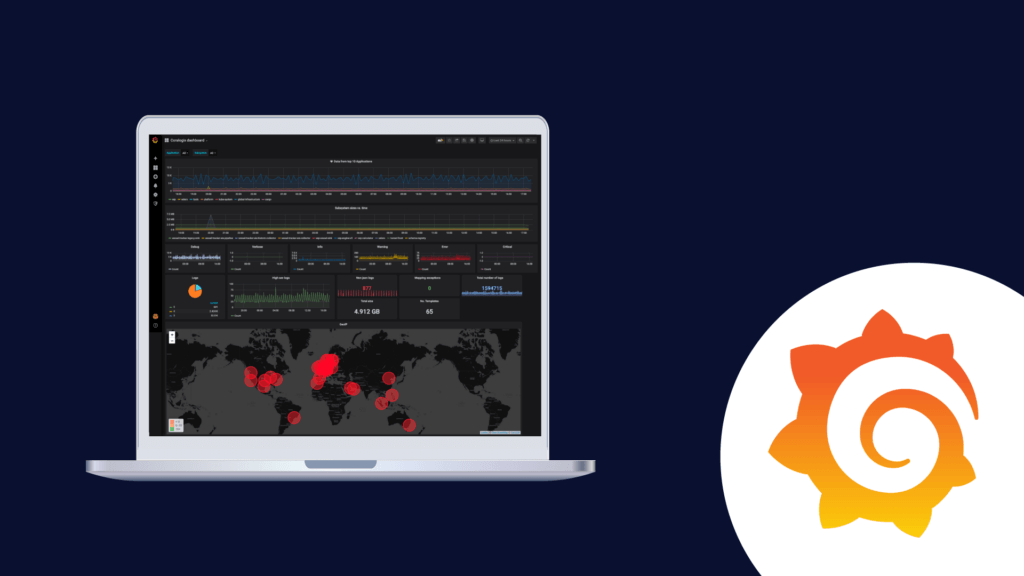
One of the most common dashboards for metric visualization and alerting is, of course, Grafana. In addition to logs, we use metrics to ensure the stability and operational observability of our product.
This document will describe some basic Grafana operations you can perform with the Coralogix-Grafana integration. We will use a generic Coralogix Grafana dashboard that has statistics and information based on logs. It was built to be portable across accounts.
The first step will be to configure Grafana to work with Coralogix. Please follow the steps described in this tutorial.
Download Coralogix-Grafana-Dashboard
Import Dashboard:
Panels are the basic visualization building block in Grafana.
Let’s add a new panel to our dashboard:
1. Click the graph button with the plus sign on the upper right corner – A new empty panel should open.

2. Choose the panel type using the 3 buttons:
3. Select “Add a new query”. It will open the query settings form and you will be able to make the following selections:
Variables are the filters at the top of the dashboard.
To configure a new variable:

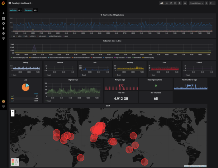

This panel includes an alert that will be triggered if an average of zero logs were sent during the past 5 minutes. To access the alert definition screen click on the bell icon on the panel definition pane. Note that you can’t define an alert when you apply a variable on the panel.


Under the “queries” settings choose to group by “Geo Hash Grid”, the field should be from geo_point type.
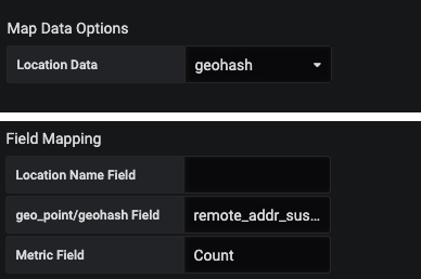
Under the Visualization, settings select these parameters in “map data options” and add to the field mapping the name of the field that contains the coordinates (the same field you chose to group by). To access visualizations settings click on the graph icon on the left-hand side.
For any further questions on Grafana and how you can utilize it using Coralogix or even if managing your own Elasticseach, feel free to reach out via chat. We’re always available right here at the bottom right chat bubble.

It is commonplace for organizations to restrict their IT systems from having direct or unsolicited access to external networks or the Internet, with network proxies serving…

AWS Systems Manager and CloudWatch Agent provide an integrated approach to observability and managing your AWS infrastructure efficiently. In this tutorial, I will show you how…

Infrastructure as Code is an increasingly popular DevOps paradigm. IaC has the ability to abstract away the details of server provisioning. This tutorial will look at…