Multi-Gauges
Create a customized multiple-gauge visualization in Custom Dashboards.
Overview
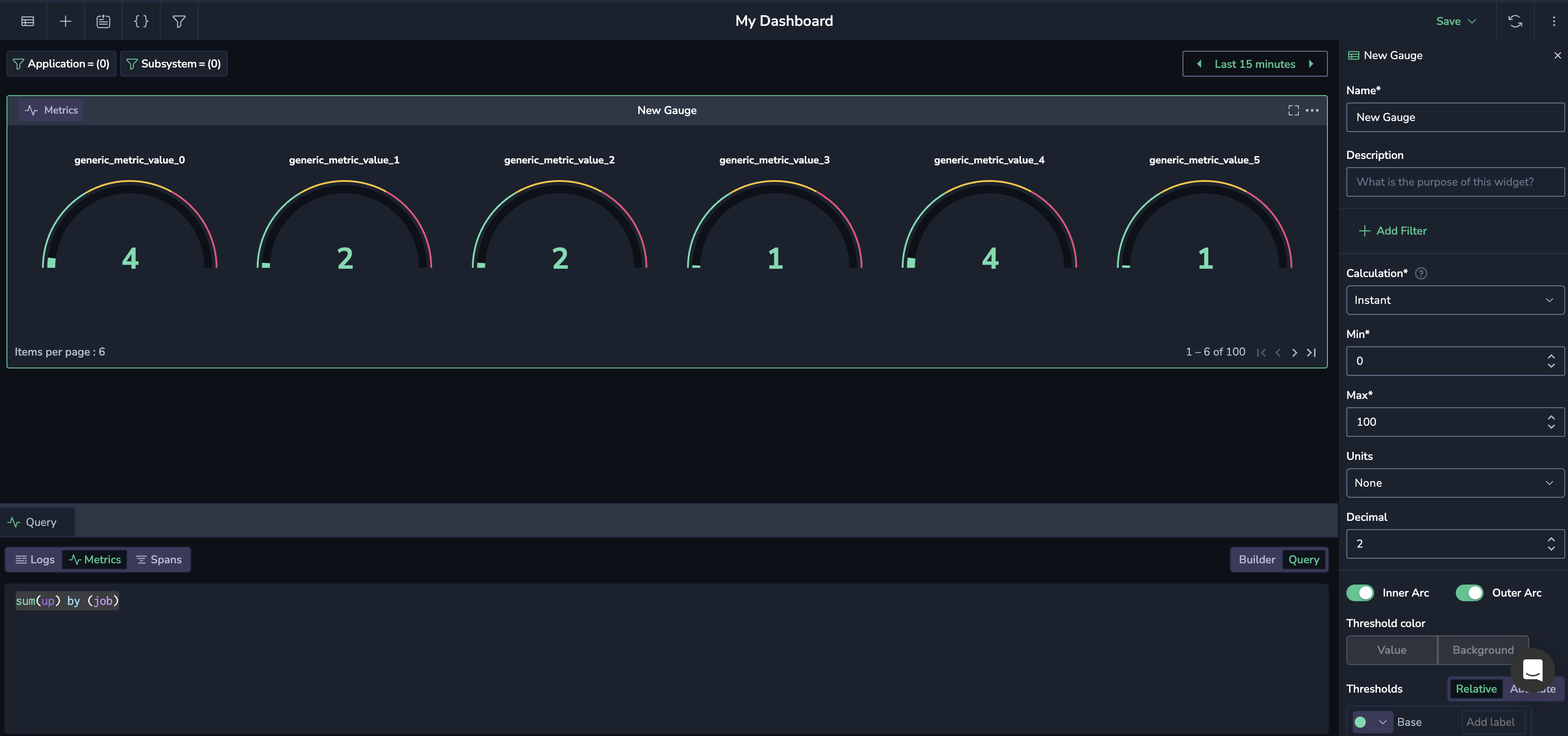
A gauge is a visual tool that displays a single value within a specified range, often resembling a speedometer or dial, and is typically used to represent key metrics and performance indicators at a glance. When you group a data set by a certain parameter, you create a multi-gauge, where each gauge represents a subset of the data. This allows for simultaneous comparison of multiple metrics across different categories or groups, providing a broader view of performance.
Getting started
In a custom dashboard, click the + icon to add a widget. To get started, drag and drop the Gauge widget from your left-hand sidebar.
Select a data source
In the lower screen panel, select logs, metrics, or spans as your data source.
Build a query
Enter a PromQL query as the basis of your widget in the lower Query panel.
If you want to query metrics, specify the metric in the panel. Use free text to search for a metric of your choice. As you do so, all relevant metrics will appear. Hover over any metric to view its metadata labels. Hover over a label to see its values.
To generate multiple gauges, incorporate the group by functionality in your query.
Select a data pipeline
Select whether to load data from Frequent Search or Monitoring pipelines. Find out more here.
Define your gauge parameters
Define the parameters for your gauge in the right-hand sidebar.
Name
Text entered in this field appears at the top of your panel in the panel editor and above the widget in the dashboard.
Description
Text entered in this field appears in a tooltip in the upper-left corner of the panel. Add a description to a panel to share important information with your team, such as its purpose.
Choose filter
[Optional] Add a filter specific to the widget to narrow down the data displayed in your gauge. Select a label and its corresponding value. Note that filters applied at the widget level work alongside dashboard filters. If conflicts exist, the dashboard filters take precedence over widget filters.
Data management
Aggregation. If you have chosen logs or spans as your data source, show an aggregated value using one of the following functions.
| Aggregation | Description |
|---|---|
| Count | The total number of data points within the selected time range. |
| Count Distinct | The number of unique data points within the selected time range. |
| Sum | The sum of all data points within the selected time range. |
| Min | The smallest value among the data points within the selected time range. |
| Max | The largest value among the data points within the selected time range. |
| Average | The average value of all data points within the selected time range. |
| Percentile XX | Represents the value below which XX% of the data points fall. For example, Percentile 95 is the value below which 95% of data points fall. |
Calculation. If you have chosen metrics as your data source, show a calculated value using one of the following functions.
| Calculation | Description |
|---|---|
| Instant | The value at the current point in time. |
| Last | The most recent value within the selected time range. |
| Min | The smallest value within the selected time range. |
| Max | The largest value within the selected time range. |
| Avg | The average value of all data points within the selected time range. |
| Sum | The total sum of all data points within the selected time range. |
| None | No calculation is applied; raw data is used. |
Units management
- Min/Max. Set the minimum and maximum values used in percentage threshold calculations. You may choose to enter a static range of numbers or a range between 0-1 or 0-100.
- Units. Choose one of the unit types or create a custom unit. Custom units are not added to a list of units, but are saved with the specific widget.
- Decimal. Specify the number of decimals displayed in the calculated value, from 0 - 15.
Visual management
- Enable or disable the Inner arc and Outer arc. The inner arc displays the actual value for your query. The outer arc displays thresholds defined. If you choose not to enable either arc, the numerical result of your query will appear as a STAT widget without additional visualizations. In this case, you may determine whether the threshold color will be applied to the value or background.
- Threshold color. Set the color/s for the values and background in your visualization.
Thresholds
A threshold is a value you set for a number that, when met or exceeded, changes the visualization's appearance based on the query results. Choose the base Thresholds – that is, when the gauge should appear green and red. Add additional thresholds if necessary. You may choose between percentage or absolute numbers.
Set the following options:
- Value. This is the value that triggers the threshold. You can assign a specific color to this value.
- Labels. Add labels to each threshold. For example, you may choose the label “good” for the base green threshold.
- Threshold type. Choose between Absolute and Percentage.
- Absolute: Defined by a specific number
- Percentage: Relative to the minimum or maximum value (e.g., 80 percent)
Support
Need help?
Our world-class customer success team is available 24/7 to walk you through your setup and answer any questions that may come up.
Feel free to reach out to us via our in-app chat or by sending us an email at [email protected].
 Light
Light light
light dark
dark User Guides
 Integrations
 OpenTelemetry
 Developer Portal