Alerts Map
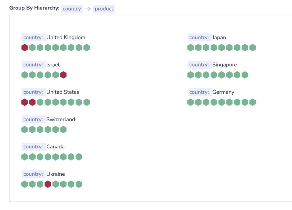
Alerts Map presents users with a visual representation of each alert status in real-time. Grouping all of your alerts in a scalable, information-dense manner, this feature ensures optimal system monitoring.
Use Alerts Map to visualize the following:
Standard Alerts (for all alert conditions except
notify immediately)
Accessing Alerts Map
To access the Alerts Map feature, navigate to Alerts in your navigation pane > Alerts Map.

Alerts Map Visualization
View Triggered Alerts
Alerts Map is divided into different visualizations based on the field or fields a user has grouped by in his / her alerts. Red hexagons represent values per key that have resulted in a triggered alert. Green hexagons represent all other conditions.

Hexagon color is updated at intervals defined by
value:time-rangein the alert definition itself:Every 2 min: When the less than\more than condition is under 30min
Every 6 min: When the less than\more than condition is between 30min to 12hrs
Every 12 min: When the less than\more than condition is bigger than 12hr
To view additional information about a triggered alert, hover over a hexagon of interest. You will see a list of all the alerts that were triggered for a specific value and how many of them have been resolved.

Filter
Filter Alters Map in the left-hand sidebar. Filter by Alert status, Alert name, and Alert Severity.

Support
Need help?
Our world-class customer success team is available 24/7 to walk you through your setup and answer any questions that may come up.
Feel free to reach out to us via our in-app chat or by sending us an email at [email protected].